Idea Number 1:

This is a sketch for an idea for the cover of my album. It is a photograph of my artist, alone. He will be positioned in the centre of the frame so that his head is in the centre of the image leaving some empty space above. I think this will not only draw the viewer’s eye directly to the artist’s face, but increase the sense of emotion that is appealing to the audience of the acoustic/alternative genre.
The shot will be fairly close-up, revealing only his head and shoulders. The artist will be looking downward, but not so much that he looks sad or depressed, just so that he isn’t looking directly at the camera keeping his thoughts/emotions slightly ambiguous.
The photo will be in black & white as this fits with the style of the acoustic/alternative genre.
The lighting will be chiaroscuro and very dramatic. A very strong light will be shone on the left side of his face, leaving the rest of the image almost entirely shadowed. This will make the cover of the album a very dramatic, eye-catching statement yet tie nicely with the genre of the music.


Idea Number 2:

The location was part of the music video I created, although in the video the singer wasn't sitting alone, and in the photo he would be. He would sit facing either away from the camera and looking over the city, or towards the camera with his back to the city. With him facing away from the camera, it is like he is looking at the city, which intensifies the sense of loneliness. With him facing towards the camera, it is as if he has turned his back on the city, and turned his back on the memory of him and the girl, which adds to the ambiguity of the music video. Although, without having yet taken the image it is difficult to judge which way creates the greatest artistic statement.

 |
| These are shots from the video footage of the wall, the cityscape, and the couple overlooking it. |
Idea number 3:

This idea has the artist sitting by the window with his guitar on his knee, a shot similar to those used in my music video. Using the rule of thirds, the artist is to the right of the frame. He is again looking slightly downward, though still his apparent emotion is ambiguous rather than sad.
This is the final photo of this design:

I've photoshopped the image to make the lighting more contrasted, and changed the image to black and white.
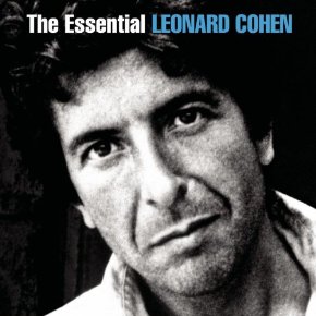
Excellent planning thus far and indicating the evolution of your ideas. The prominence of the artist in your research of similar artists' cover art is proficiently evaluated. I agree that an artist such as Cope and reputable artists like Leonard Cohen speak directly to the audience, thus a close up of the artist on the front cover indicates this artist is directly addressing his/her fans.
ReplyDeleteYour research is interesting and suggests your strong visual awareness.